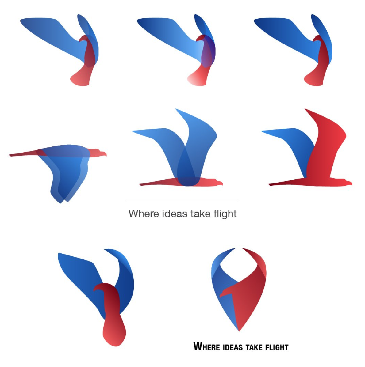
DHA Usability Lab Logo Design Concepts
The Defense Health Agency established a new department focused on usability testing and research. They named it the DHA Usability Lab, but needed branding created. I was one of the designers tasked with creating a logo for the new department. Although none of my specific designs were used in the final logo, my work was reflected in the logo chosen to represent the Usability Lab.
The Problem
The Usability Lab had no logo or established visual identity yet for its branding and marketing, something needed to stand out at user recruiting events. Despite being called a “lab”, it wasn’t a laboratory in the typical sense but an office space dedicated to user testing telehealth products. The logo would have to represent that somehow.
The Process
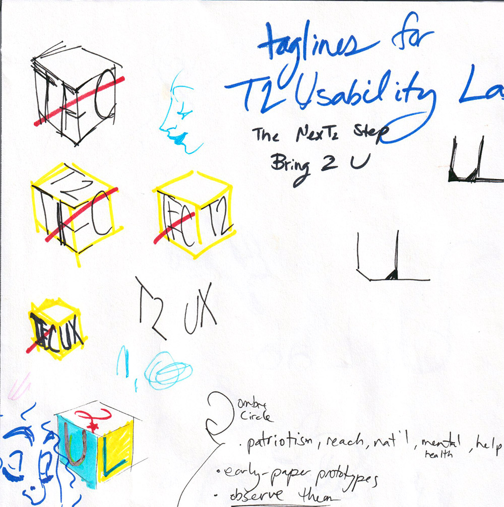
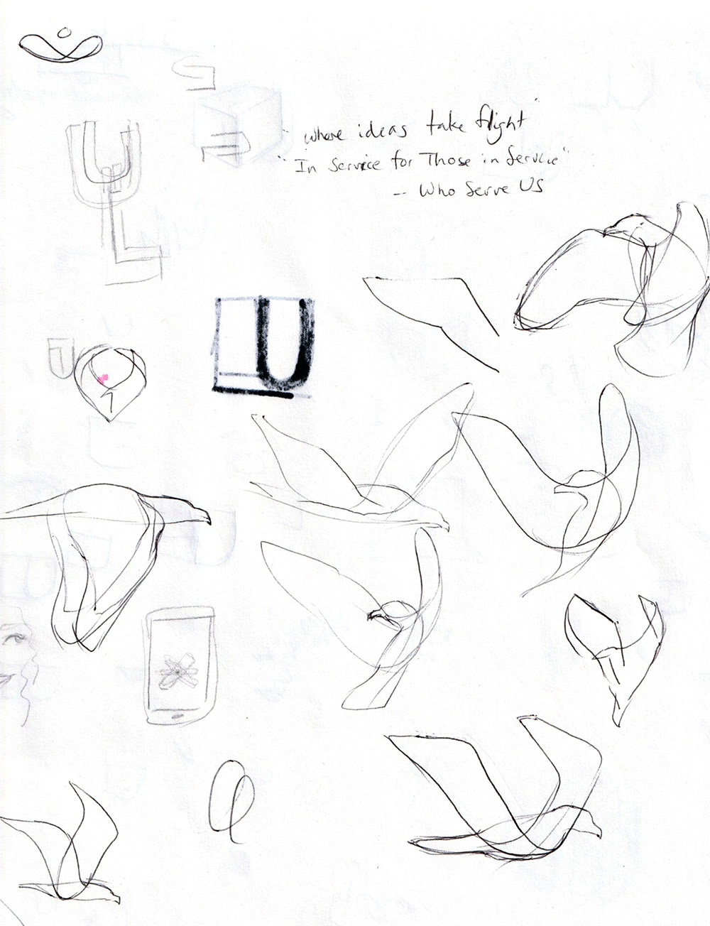
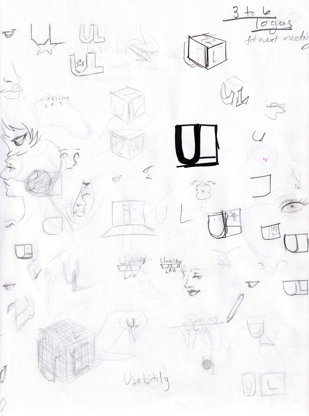
Sketching ideas out by putting pencil (and pen and marker) to paper.
When starting a new illustration or design, I begin with rough paper sketches before moving into a digital medium. I find it easier to quickly throw an idea down and experiment to see if it’s something I can explore further in color.
As a government entity with multiple stakeholders, it’s difficult to predict what sort of design would satisfy so many people. Although more conservative designs tend to win out in government work, I experimented with a range of ideas for the logo.
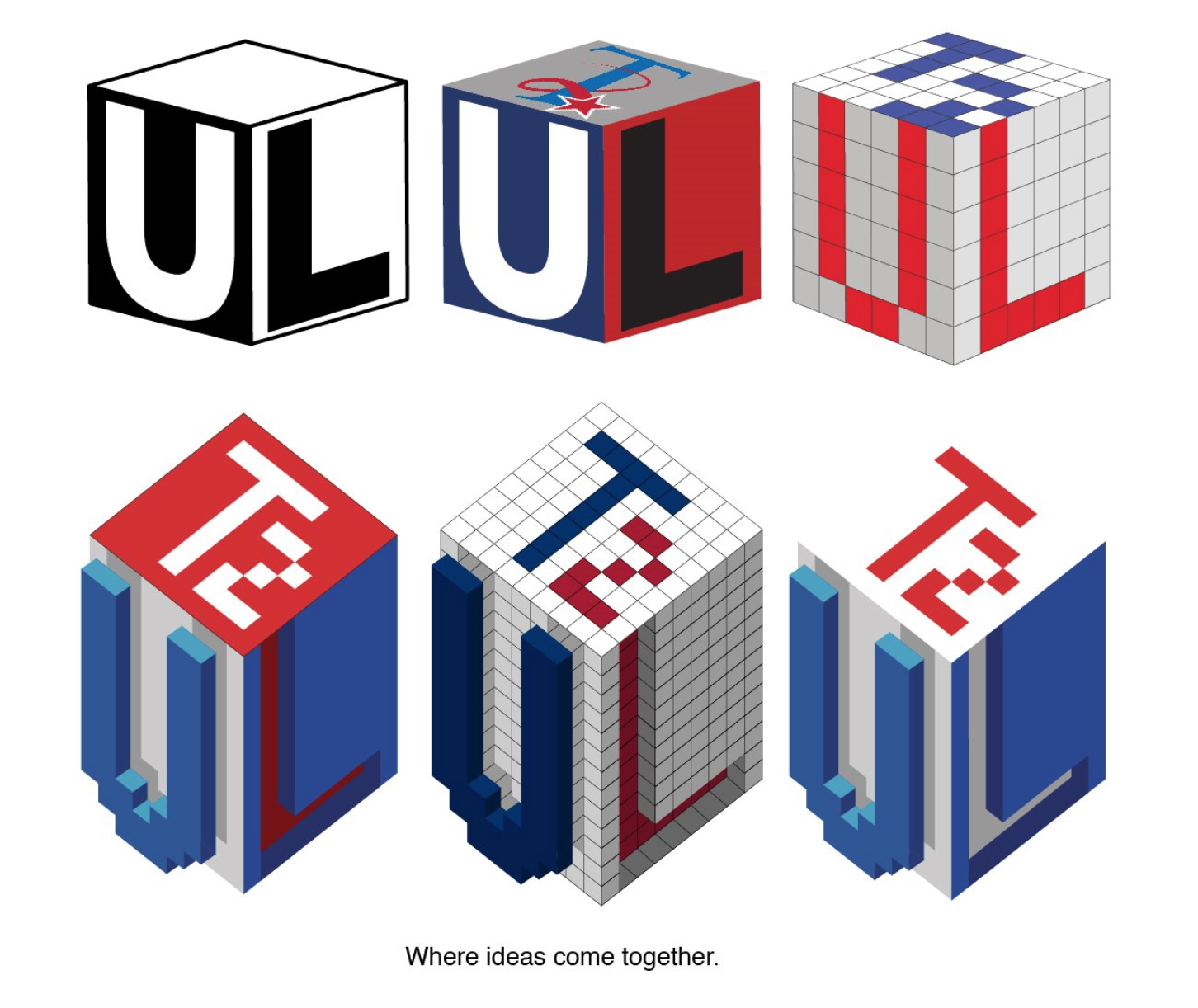
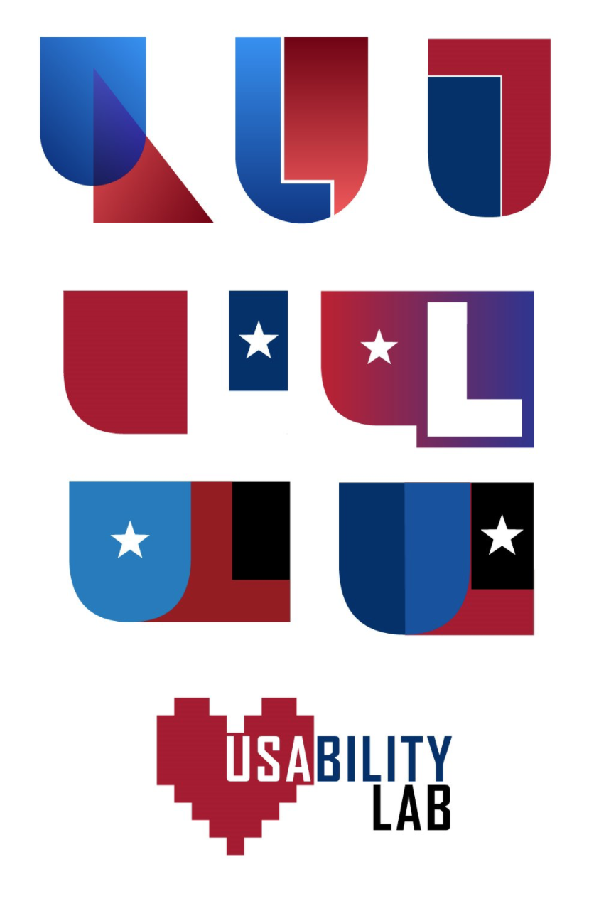
I used Adobe Illustrator to refine and finalize logo concepts in vector form.
The Solution
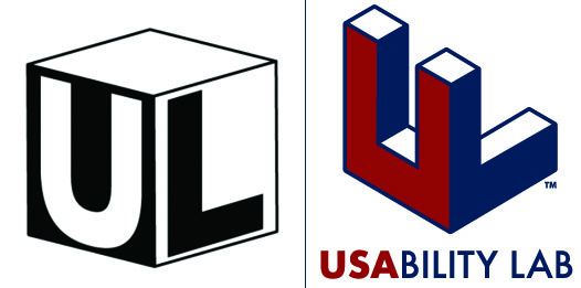
Me and my design colleagues all shared our work amongst each other to narrow down the list of options to present. Ultimately, a different designer took over the remainder of the project, but my work would inspire his.

I was actually really excited when I saw what my colleague did with it. Teamwork makes the dream work!