The Defense Health Agency (DHA) provides healthcare for military, and owns Military Kids Connect (MKC). MKC is an online resource for military children and their families, but needed a new website design. My role in this project was the primary UX/UI designer.
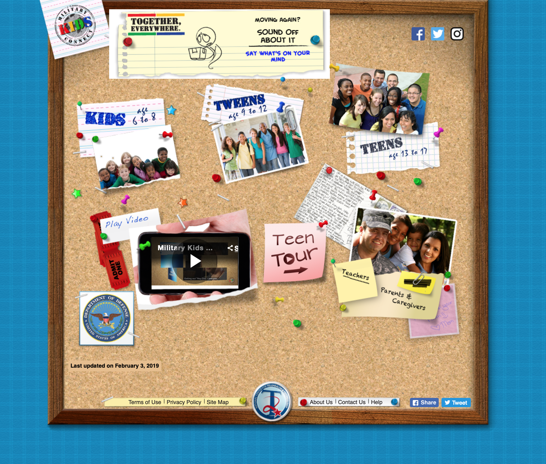
Military Kids Connect (MKC) is a website and online resource for children in military families. The website had many excellent resources but its design was severely outdated: not mobile responsive, used Flash plugin for web apps, and its information architecture needed restructuring.
I was tasked with creating a responsive design and an entirely new experience for users.
LAYOUT DESIGN
The new site design would be responsive, but the early designs were focused on creating a look on desktop. The colors and typefaces were picked from an established style guide. The new site would be more visually focused on adolescents and teens and move away from imagery on young children. Due to project constraints, there wasn’t much time for research or sketching and testing ideas – basically requiring diving into the design work feet-first.
I joined this project shortly after launch, with a desktop design already almost finished. I refined the new desktop design further before moving into the layouts for tablet and smartphone screen sizes.
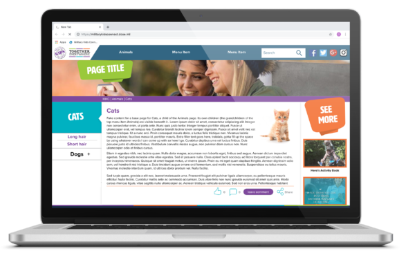
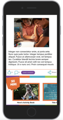
I created the first iterations of mobile and tablet based off the initial desktop concept. One challenge was how to adapt columns of content to mobile: two navigation menus as well as a right-side “see more” section that had to be moved under the main content. In comparing other sites’ mobile layouts, I found that mobile side-scrolling would be easy for kids to use and make a good interaction choice for the “see more” section.
I designed the primary (top nav) menu for the new site to collapse into a classic hamburger menu on small screens. To avoid creating a giant series of menu children and grandchildren to navigate, each primary menu item would have its own sub-menu load with the page. This menu would be visible on the left side of the page on desktop, and shrink into an accordion/drop-down menu on smaller screens.
I created the first iterations of mobile and tablet based off the initial desktop concept. One challenge was how to adapt columns of content to mobile: two navigation menus as well as a right-side “see more” section that had to be moved under the main content. In comparing other sites’ mobile layouts (seen below), I found that mobile side-scrolling would be easy for kids to use and make a good interaction choice for the “see more” section.
I designed the primary (top nav) menu for the new site to collapse into a classic hamburger menu on small screens. To avoid creating a giant series of menu children and grandchildren to navigate, each primary menu item would have its own sub-menu load with the page. This menu would be visible on the left side of the page on desktop, and shrink into an accordion/drop-down menu on smaller screens.
INFORMATION ARCHITECTURE
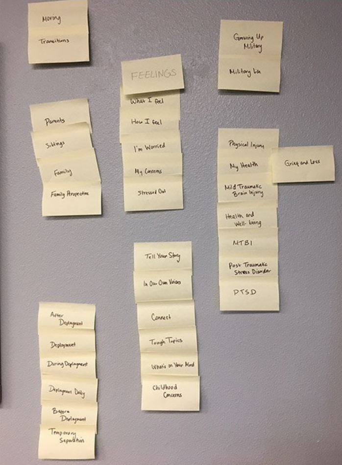
The new website would merge the age tracks together and needed an new approach to its information architecture. At an afterschool program on base, we split 15 volunteering children into three groups to do card sorting.
The group I observed could not figure out how to use some of the cards given to them, but with some surprising results (for example, at ages 12-15 none of them knew how to read the word “coping”). This information was useful in deciding how to re-name pages for the site’s new IA and rethinking the vocabulary as a whole.
Based on what we learned that day, the design team recommended that content be organized under the following primary navigation items: Military Life, Feelings, Health & Wellness, and Caring For Our Youth.
The new website for MKC had it’s soft launch in late February 2018. While the kinks were still being smoothed out, it was exciting to see it finally go live!
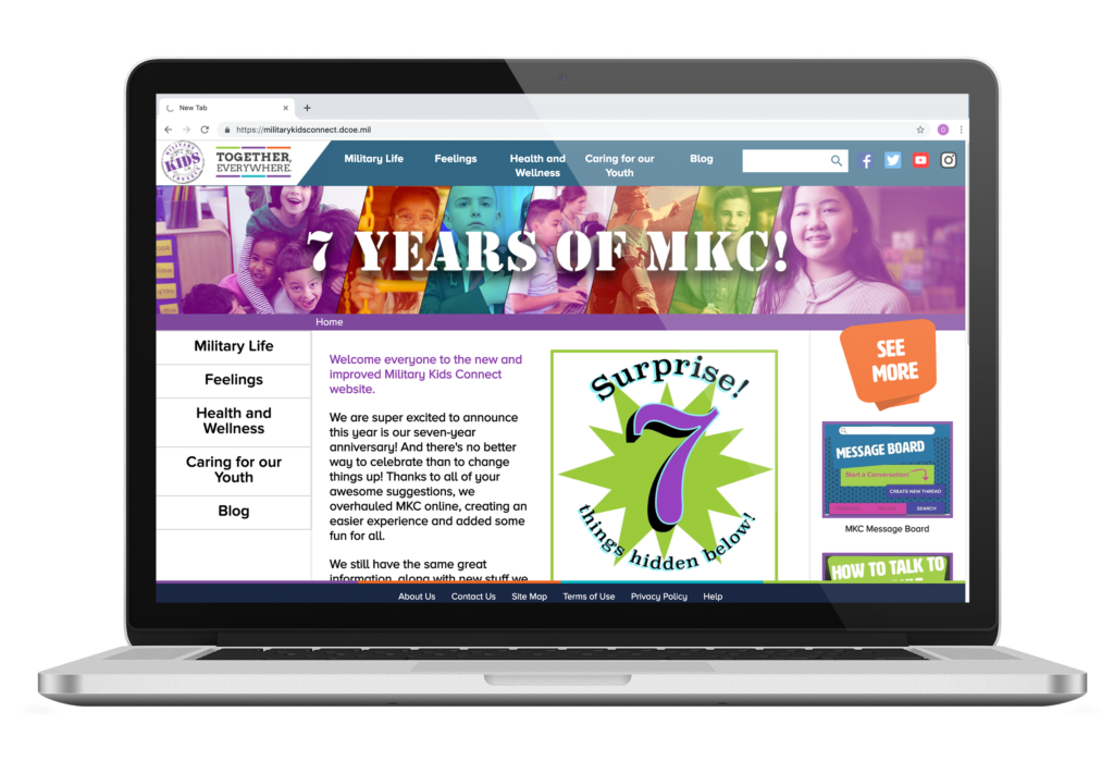
When all designs were finalized, developers were not far behind in finishing the build. The product team was thrilled to see the new site finally come together, but would need further work on creating visual content for the new site. I stayed with them as their visual designer to create new graphics, content, and even motion graphics.
WHAT’S NEXT?
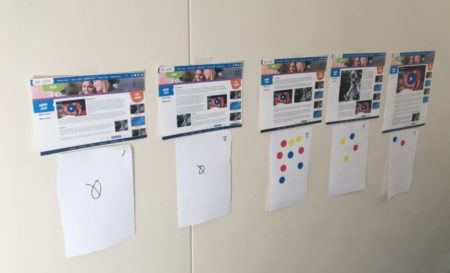
Once the new site went live, usability testing was conducted at a school fair with kids from all over the district stopping by our table. I wrote the test plan, moderated most of them, and wrote UX recommendations based on the results.
I also worked with the product team to create fun graphics and new content for the site. All the kids loved Doc, a kind advice columnist, whose design was based off the product owner’s cat.
Although I left DHA soon after this project wrapped up, I hope to see MKC grow in the future with new web apps for games and activities. (For more on that, please see my earlier project Where Are You Going for MKC, where I redesigned an educational Flash game for the modern web.)

