IV Admixture is an app prototype developed by the Web & Mobile Technologies group at the Defense Health Agency (DHA). The app is aimed at new nurses and nursing students who are studying the mixture of IV medication. It is intended as a fun and interactive study aid for Android users. It has three levels that challenge players to match drug information or simulate the IV mixture process. I was a user researcher for this project.
The IV Admixture app prototype was quickly built using the Unity game engine. The stakeholders provided the materials and the need to create a fun and interactive study guide for new nurses. Once the first iteration was built from that information, the development team needed to see how effective and user-friendly the game app would be for new medical professionals.

USER TESTING
The UX team wrote a test plan to see how users interacted with the app and if they could successfully complete each level. We recruited medical professionals experienced with IV drug mixture to test the app.
There were three levels to play:
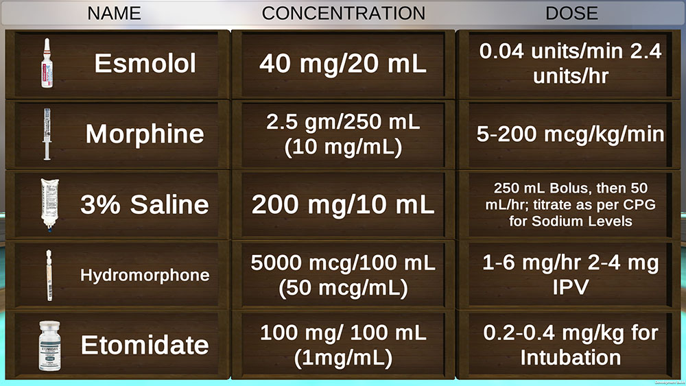
- Level 1: Match the drug name with its dosage and concentration, all printed on blocks. The blocks would disappear if matched correctly.
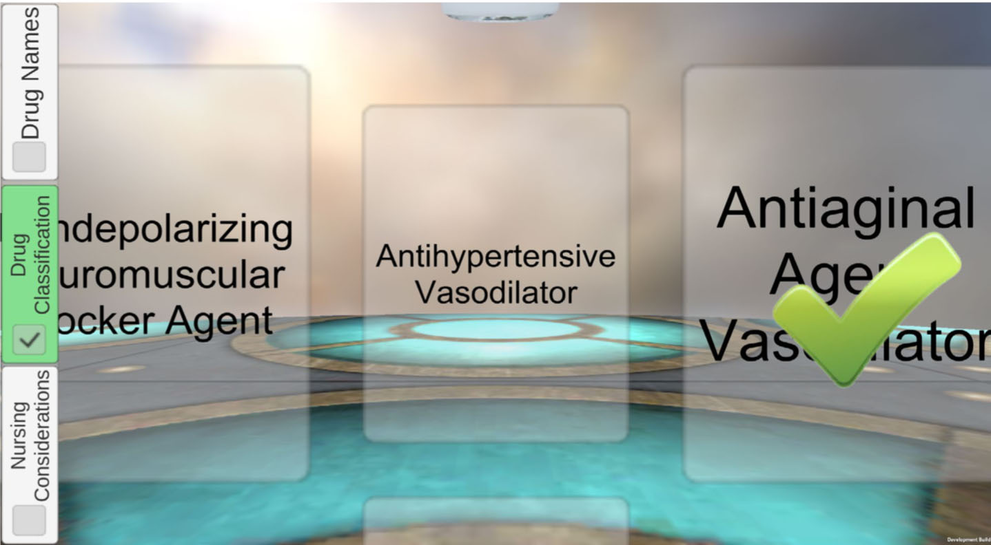
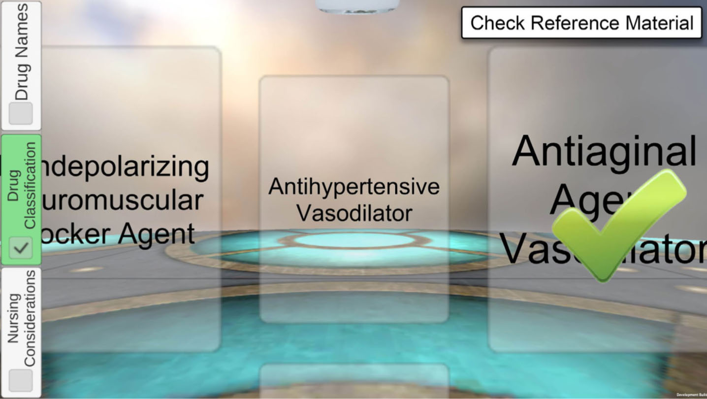
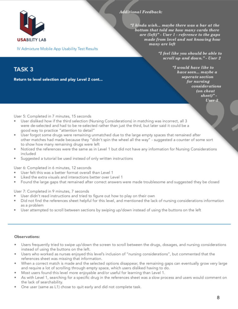
- Level 2: Match the image of the drug bottle to its classification and ‘nursing considerations’ (side effects), each in its own horizontal row. The selected items would disappear if matched correctly.
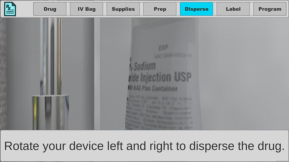
- Level 3: A 3D simulation of the IV mixture process. It would take place in a room with all the objects a nurse would expect to use, even alcohol wipes. The user would be given orders and information from the primary healthcare provider to start.
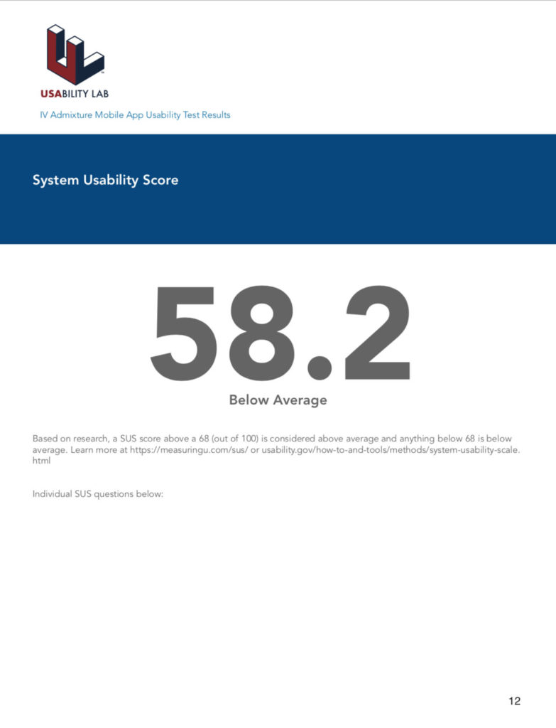
Seven usability tests were conducted over a two-week span of time, both on-site and at remote locations. I gave participants tasks to do in the app and observed how (or if) they completed them, with each task timed to compare between users. Once a user had completed all tasks, they would complete a System Usability Scale survey.
FINDINGS
Despite a lack of app documentation provided to my team as well as no medical training of my own to reference, most problems were consistent our usability tests. A few examples were:
- In Level 1, users were annoyed when the best matches they could think of never worked. It turned out not all the blocks loaded on the screen could be matched, but users had no way of knowing this. Only after a user made a correct match would new blocks load with the information that was missing before. In other words, sometimes a match was impossible because all 3 blocks for a drug weren’t visible yet – only 2!
- In Level 2, when selections were correctly matched, the items would disappear and leave a large gap. This meant a lot of scrolling around empty spaces to find what matches could still be made. Users found the controls a bit confusing as well, since swiping left/right would scroll the items, but swiping up/down would not switch categories.
- In both Level 1 and Level 2, users could only access the drug reference material after making repeated errors. There was no way for users to open the reference material except by deliberately making wrong selections until the document opened automatically.
- In Level 3, users could not backtrack through the IV mixture simulation to check on relevant information. Real-life medical providers are constantly double-checking their work, so the users found this exceptionally irritating. Additionally, Level 3 did not have access to drug reference materials, which was not consistent with the first two levels.
Once we finished with usability testing, I wrote the UX recommendations document for the development team based on what we learned.
Users showed mixed feelings towards the app, but mostly found the concept useful for studyng IV admixtures. While we discovered a lot of problems in testing, all of them could be solved.
The UX recommendations document I wrote for the development team detailed all important findings, a breakdown of the SUS score, and proposed fixes for usability problems. I tried to keep suggested changes as simple for developers, while still being effective improvements for users’ pain points.
The head of development for this project was extremely appreciative of the time spent testing and analyzing test results. However, the dev team would need to clear up the inconsistencies with the drug data provided to them by the stakeholders before the project could push forward.
