The Usability Lab had no logo or established visual identity yet for its branding and marketing, something needed to stand out at user recruiting events. Despite being called a “lab”, it wasn’t a laboratory in the typical sense but an office space dedicated to user testing telehealth products. The logo would have to represent that somehow.
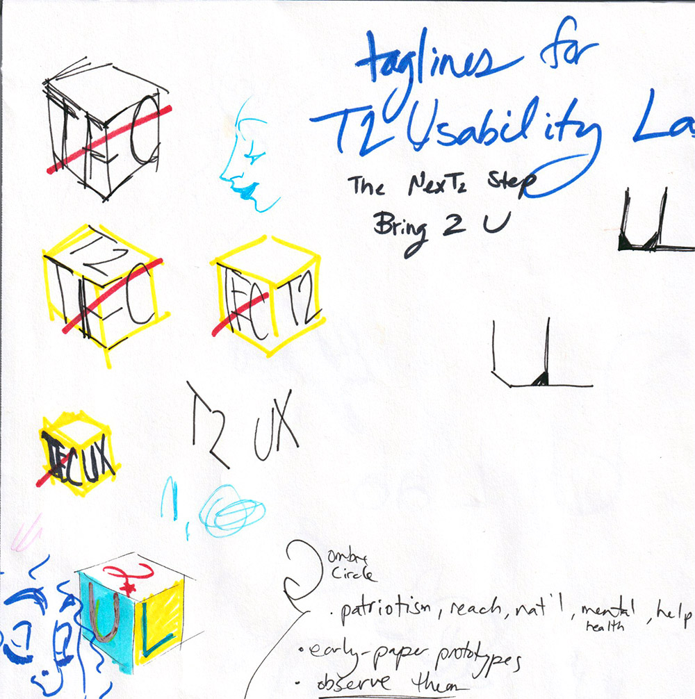
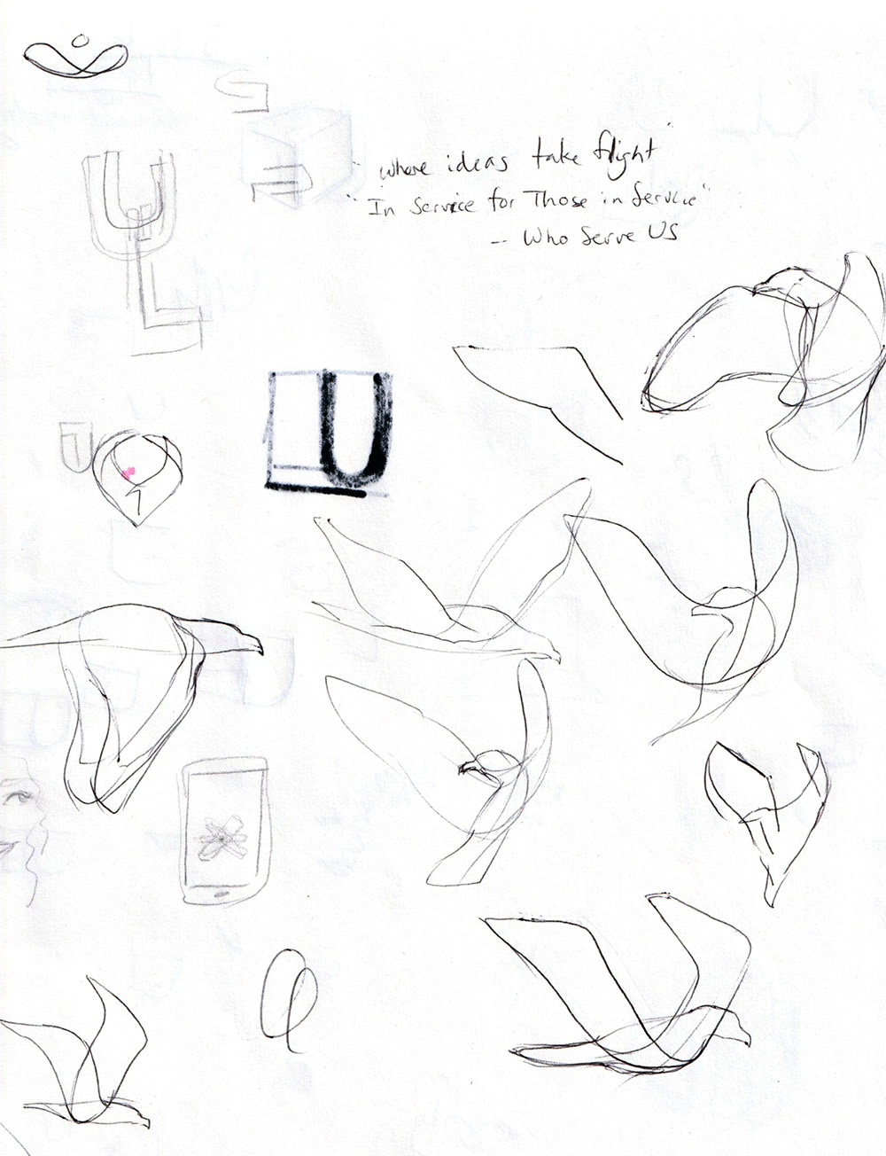
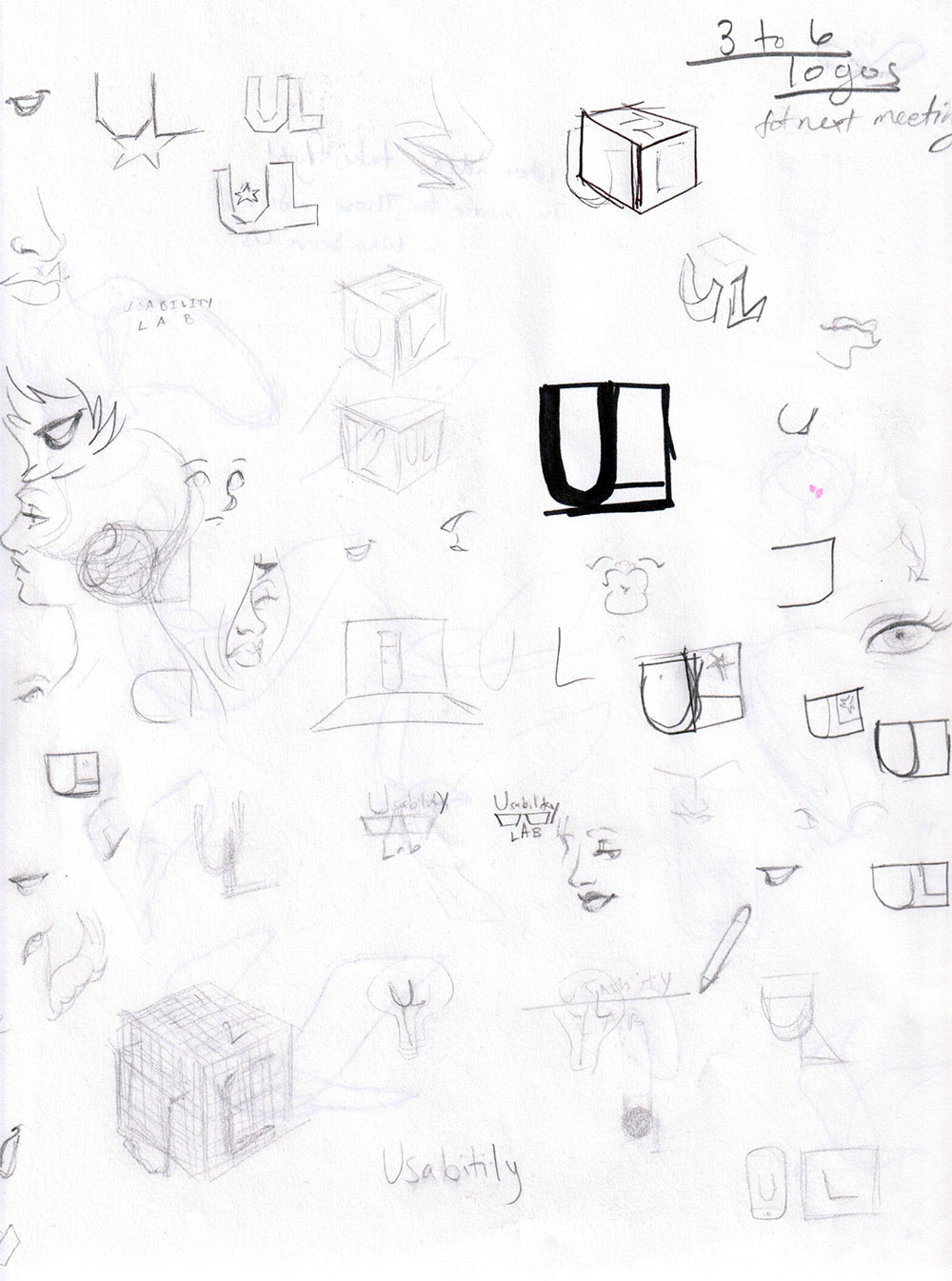
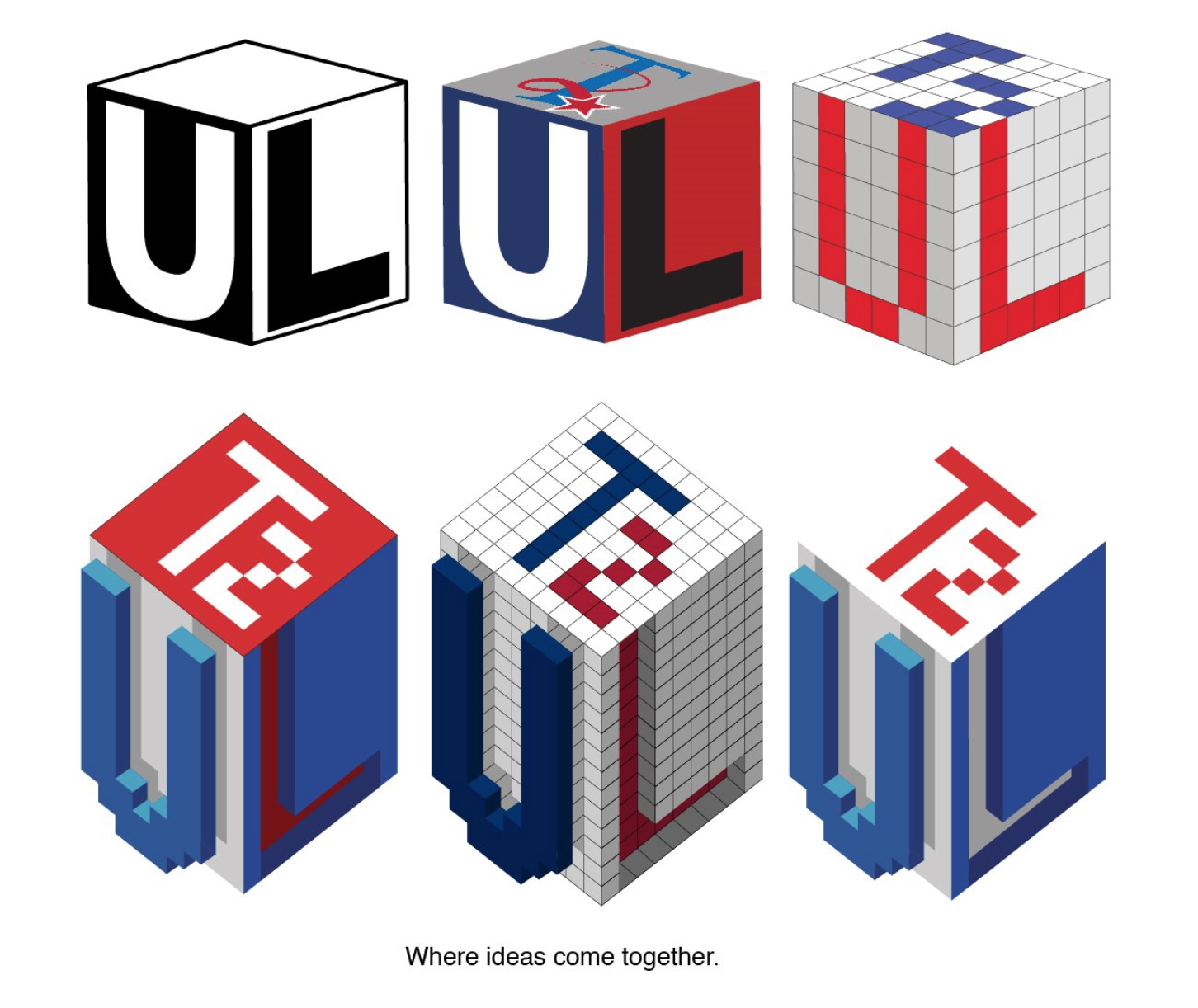
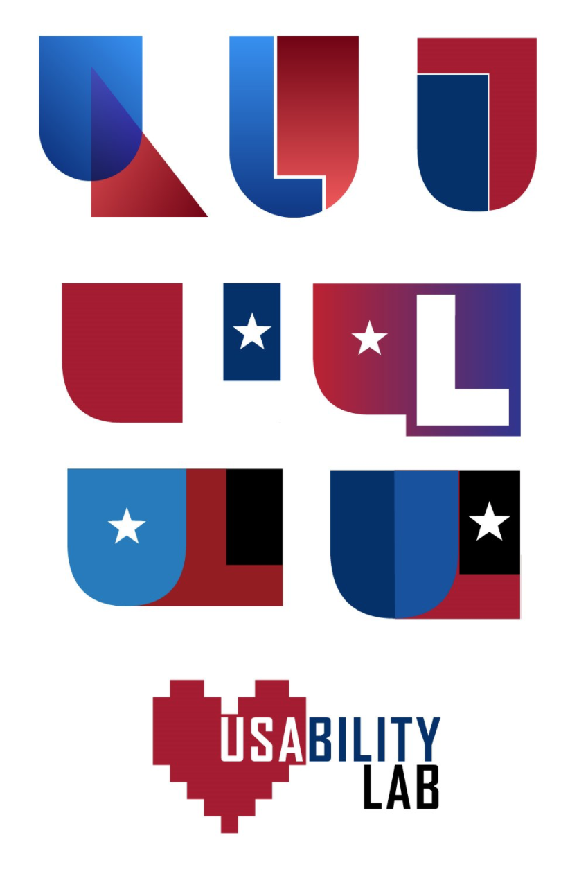
When starting a new illustration or design, I begin with rough paper sketches before moving into a digital medium. I find it easier to quickly throw an idea down and experiment to see if it’s something I can explore further in color.
As a government entity with multiple stakeholders, it’s difficult to predict what sort of design would satisfy so many people. Although more conservative designs tend to win out in government work, I experimented with a range of ideas for the logo.
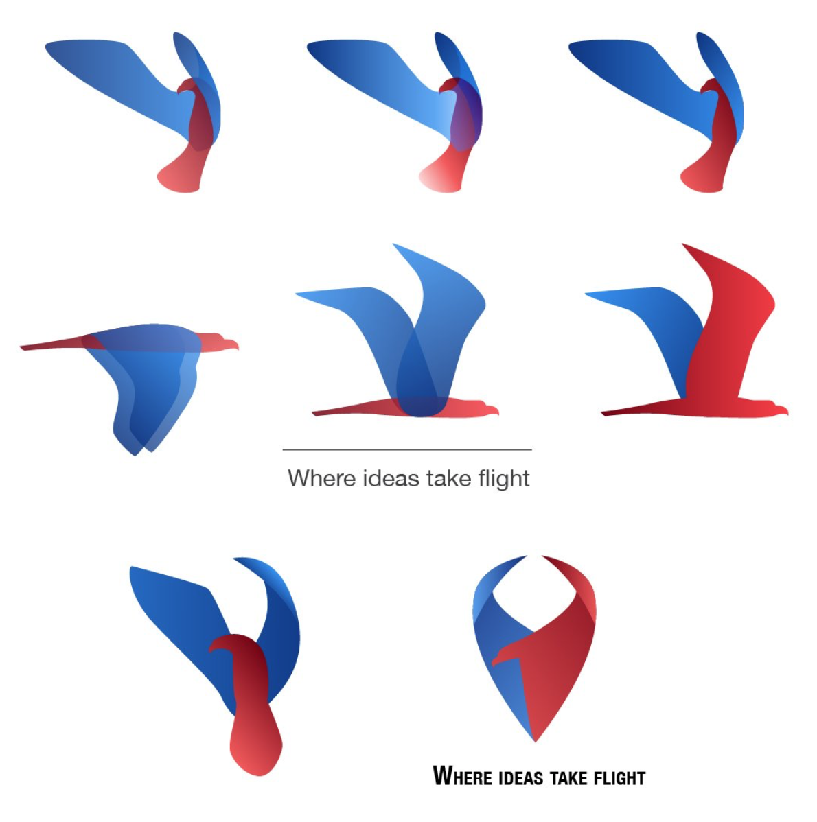
Me and my design colleagues all shared our work amongst each other to narrow down the list of options to present. Ultimately, a different designer took over the remainder of the project, but my work would inspire his.
I was actually really excited when I saw what my colleague did with it. Teamwork makes the dream work!